Crafting a memorable logo goes far beyond picking a trendy font. Your logo acts as your brand’s visual identity—it’s often the first thing people notice. While typography certainly matters, it’s just one piece of a much bigger puzzle. For those eager to explore different typographic options, Creative Fabrica provides a variety of free font collections perfect for experimenting with style and tone.
Simplicity Paired with Substance
Great logos tend to be clean and simple—but don’t mistake simplicity for shallowness. The most effective logos carry deeper meaning. Brands like Apple and Nike use minimal shapes that are instantly recognizable and tied to their core identity.
When designing your logo, eliminate anything that doesn’t serve a purpose. A clutter-free layout makes your logo more versatile and easier to remember. Still, simplicity should reflect purpose. A bakery, for instance, might include elements like wheat or an oven shape to reinforce warmth and authenticity.
As Md Tamzid Mahmud Angkon put it:
“Your logo is your business’s first point of contact with the world. If people connect with your branding, they’ll be more open to what you’re offering. Great logo design requires a mix of design expertise, creative theory, and technical execution.”
This quote underlines the importance of not just making your logo look good—but making it feel right.
Let Color Tell a Story
Color does more than just decorate—it influences emotion and perception. Blue often suggests reliability and calm, red speaks to passion and urgency, while green evokes freshness or growth. When choosing your palette, start by asking what kind of feeling you want your audience to associate with your brand.
Stick to two or three colors to maintain clarity. A chaotic rainbow of tones can dilute your message. Also, be sure your logo holds up in grayscale or black and white. This is crucial for print materials, packaging, and other low-color environments.
Color should also match the personality of your fonts and symbols. A delicate font can be balanced with deeper tones, while strong colors may pair well with lighter, more minimal text.
Shapes Speak Louder Than You Think
Beyond fonts and color, the shapes in your logo can say a lot. Circles feel inclusive and harmonious, squares suggest trust and structure, while triangles imply movement or innovation. Each shape carries its own emotional footprint.
When choosing your design elements, ask yourself: what tone should this logo set? A wellness brand might lean on curves and soft lines, while a cybersecurity firm may benefit from sharp edges and firm angles.
Ensure that shapes don’t overpower the text or vice versa. Cohesion between all elements ensures your logo works as a single, unified design.
Make Sure It Works Everywhere
Your logo will appear in a variety of sizes and settings—from large storefront signs to social media icons. A great logo is flexible and still looks great at any scale.

Test it across different mediums and backgrounds. Print it in black and white, shrink it down, and view it on mobile devices. These steps will reveal whether your design holds its integrity or needs adjustment. In general, simpler logos tend to scale better and retain legibility across platforms.
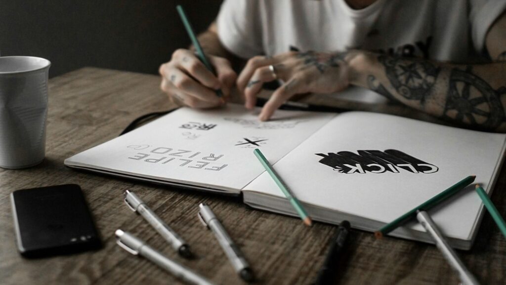
Don’t Forget the Fonts
Font selection remains an essential element of logo design. Your font sets the tone for your brand—whether it’s classic and refined or modern and clean. Serif fonts offer tradition and reliability, sans-serif fonts convey freshness and clarity, and script fonts add a personal, artistic touch (though readability can suffer if overdone).
Limit yourself to one or two font types. Too many styles can lead to visual confusion. Try combining a bold style with a lighter one to create visual contrast and hierarchy. For inspiration or testing different styles, there are plenty of free font resources online that can help you refine your look.
Be Original—Stay Memorable
To truly make your logo stand out, it must be unique. Steer clear of trends or styles that are already saturated in your industry. A distinctive twist—be it in the shape, color, or typeface—helps your brand stand apart.
Do a quick scan of your competitors’ logos to ensure you’re not treading on familiar ground. This isn’t just about being original—it also protects you from potential trademark issues down the line.
Wrapping Up
A strong logo is never just about the font. It’s the harmony of typography, shape, color, and meaning that creates something memorable. To design a logo that leaves a lasting impression:
- Aim for simplicity with purpose
- Choose colors that evoke the right emotions
- Select shapes that reflect your brand identity
- Make sure it works in all sizes and formats
- Keep it unique and recognizable
Your logo is more than just a symbol—it’s the visual gateway to your business. Done right, it not only communicates who you are, but invites people to engage with you. Look beyond just the font, and you’ll be on your way to building a timeless brand identity.